“NEWMEDIA not only met, but greatly exceeded our goals for the project. They were incredibly responsive, quick to offer great solutions, and brought expertise we didn’t have. Their ability to think outside the box and create beautiful experiences for our customers is incredible.”
User experience UX design.
of User Experience?
Those types of bad user experiences result in a loss of business, as this chart from Marketing Charts displays:
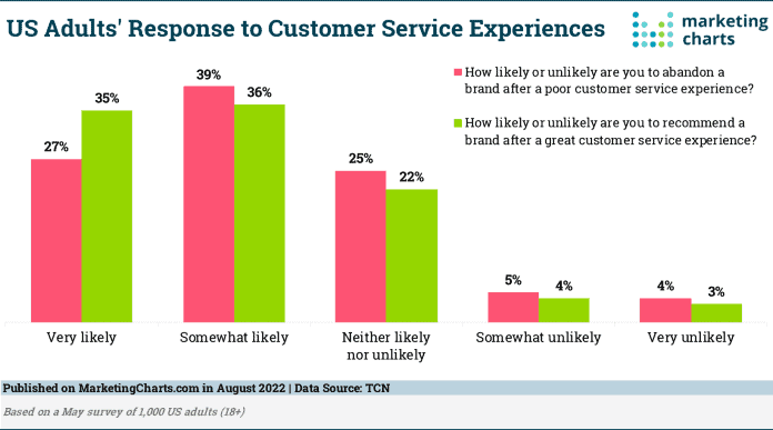
According to this chart, 27% of people are “Very Likely” to abandon a company after a bad customer experience, with 39% saying their “Somewhat Likely” to leave. On the flip side, the feedback stats show that 71% of people are either somewhat or very likely to recommend a brand if they enjoy a good experience.
The message is that how a user interacts with your service (and how they feel as they interact) matters. Get it wrong and customers jump ship and don’t recommend you to others.
So, how do you deliver an experience that matches up to what your visitors expect?
By combining user interface design and user experience design to wow visitors to the point where they don’t want to leave. And with NEWMEDIA, you’ll create customer-grabbing user interfaces while taking your visitors on the user journey that carries them from awareness to purchasing.
Marketing Director
Take your website to the next level with award-winning design.
Get my custom quote(UI) Design?
Many people make the mistake of assuming that user interface (UI) design and user experience (UX) design are the same thing. There are parallels between the two (with UI playing a part in UX), but they’re different.
Starting with UI design, this is all about how your website or app looks and feels to a user. It covers everything from the graphical user interface that visitors use to work their way through your website (incorporating imagery and navigational links) to your interaction design. In other words, what happens when a visitor clicks a button or tries to use a voice command to get to where they want to go.
A good UI achieves several things, both for your business and in terms of the user’s journey
- Communicates your brand’s messaging by ensuring consistency across multiple pages and platforms
- Creates a design that the user enjoys, encouraging them to keep on clicking through textural and visual design elements
- Reinforces the user’s trust in your business because they can see that everything looks professional and well-maintaine
That last point is especially important, as this start from Exploding Topics demonstrates:
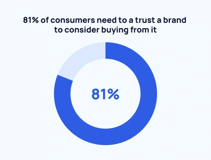
Four out of every five people who land on your website (or use your mobile app) need to feel like they can trust you before they’ll consider buying from you. If that trust doesn’t exist due to your user interface design being so clunky that you come off as unprofessional, you lose the ability to sell to a huge segment of your target audience.
The Benefits of Working with a UI Designer
Beyond the trust element, there are three benefits that the mastery of visual interface elements brings to your business:
Keep People On Your Website
User interface designers develop the look and feel of your website and apps. And that combination of look and feel is vital to your visitors, as this collection of stats from Companion Link highlights:

We’ll put a pin in the fact that 88% of people abandon a site after a bad user experience and focus on the issues of layout and content. Both of these fall under the user interface remit and getting them wrong leads to a shocking 38% of people leaving a website before they’ve taken any time to browse your products.
Can you afford to let over a third of your potential customers go because you have unattractive visual design elements peppered throughout your site? We’re sure that most businesses don’t want to alienate such a huge portion of their customer base, which is why we make it our UI designer’s job to create sites (and apps) that keep people engaged.
Make Your Site Visually Appealing
Now that we know that web design has such a severe impact on user behavior, it’s worth digging deeper into the statistics. Take a look at the results of this survey from Marketing Profs:
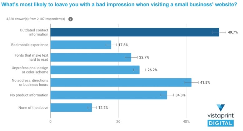
The survey quizzed 2,107 people about the aspects of a site that will leave a bad taste in their moves if they’re done poorly. Third on the list is the use of fonts that make it difficult to read content, with 23.7% of people saying that they get a bad impression of a site because of this simple user interface mistake. An unprofessional design puts off 26.2% of people, too, meaning that about a quarter of your website’s visitors will think less of your business if you fail to create interfaces that are up-to-date and attractive.
Both UX and UI design combine to make your site visually appealing. From a user interface perspective, NEWMEDIA’s graphic designers ensure your visitors get a true feast for the eyes (and one they’ll want to keep eating) when they land on your site.
Master Interactive Elements
There’s no point in looking the part if there’s no substance behind what your website does. If the visitor can’t interact with the various elements of the site, you may as well present them with a virtual business card and live in the blind hope that they’ll call you.
That’s not what your visitors want.
They want sites that contain interactive elements (such as navigational links, buttons, and similar graphical design features) that make it easy for them to get to where they need to go:
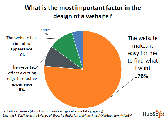
HubSpot’s survey of 174 consumers (none of whom work in web or user interface design) found that over three-quarters (76%) say that the ability to find what they want easily is vital to a website’s design. Interestingly, 9% of people say that they want to see a cutting-edge interactive experience from every design they visit. Combine the two and you get 85% of people telling you that the user interface created for your site needs to be up to date while making it easier for them to get to the good stuff.
NEWMEDIA handles this for you, with the entire process of interactive user interfaces falling under the remit of our talented team.
See Our Portfolio
Molly Hall Dorais
Colorado Rocky Mountain School
Get a beautiful, functional website optimized for SEO and mobile.
Request a proposalWhat UI Designers
Our UI designers work to create the visual and interactive elements your website needs to keep customers engaged. Here’s what we do.
Create Simple and Clear Visual Elements
Take a look at this landing page design (courtesy of Justinmind):
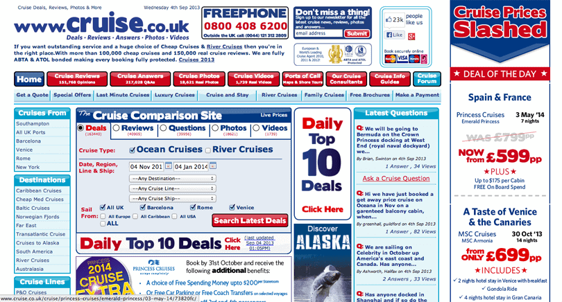
What we see here is a cluttered mess of user interface elements, none of which seem to have any rhyme or reason attached to their placement. What on Earth do you click first? Should you check the 10 daily deals (there are at least two ways to get to those) or look at the “deals of the day”? What about the cruise comparisons, and what’s this about the destinations for the cruises? It’s all so confusing, with the above website serving up a recipe of design ingredients that come together to create a dish that a customer is more likely to spit out than enjoy.
Simplicity is the key to good UI design, which starts with using clear visual elements to show website visitors where they need to go. Think of your user interface as a map for the visitor. On that map, you’re going to highlight important landmarks and put virtual “signs” up to give the visitor directions. But you have to find the right balance between directing the visitor and bombarding them with confusing information.
NEWMEDIA’s clear and simple designs keep you away from the clutter.
Develop Consistency Across Desktop and Mobile Apps
Let’s come back to the trust issue mentioned earlier.
Imagine that you’ve spent the last 10 minutes messing around on a company’s website. You’ve got a good feel for their design, as they use red and white for most of their branding flourishes, in addition to using a funny tagline and consistent logo on their web pages.
You’re impressed, so you decide to download the company’s mobile app.
The download completes and you tap the app, only to be presented with a weird gold and black color scheme. That logo that was all over the place on the website is nowhere to be found and you can’t see the tagline anymore. If you didn’t know better, you’d say the app was for a completely different company.
Therein lies the problem with a lack of design consistency. The user interface flourishes and designs you use to captivate customers on one platform need to carry over to every other platform that’s in your control, or you risk losing the trust of people who might buy from you. The stats prove that, too, as we see from this LocaliQ statistic:
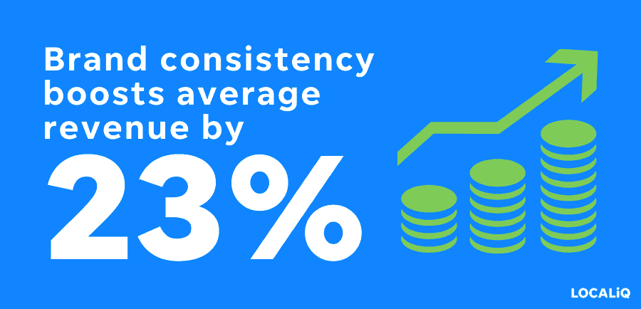
Maintaining consistency in everything you deliver to your customers (from the look and feel of your websites to the level of service you provide) boosts revenue by 23%. NEWMEDIA’s UI design team ensures you stay consistent in everything you create.
UI Designers Create Communication Interfaces
It’s obvious that communication matters to customers (if you don’t communicate, you alienate people), but it’s less obvious how you can create a user interface that communicates for you.
We take a two-pronged approach.
First, there are the basics, such as what your interface says directly to the customer. This is where your visual design elements come in, such as buttons that direct people to attractive areas of your site or your content layout (which communicates what the visitor should pay attention to).
Second, there’s the less obvious communication – what your website says when something goes wrong.
For instance, what happens if a customer is happily clicking through pages on your website only to land on a broken link that takes them to a generic 404 page? That 404 doesn’t tell the person anything about what’s just happened (or what they can do to get back to the working part of the site), so they abandon ship.
That’s poor user interface communication in action.
It’s much better to create customized “things went wrong” pages, such as a 404 page that explains that the visitor has clicked a broken link and gives them a route back to where they came from.
Communication comes in two forms. There’s the way you use your user interface to guide people to where they need to go, and there’s how you communicate when something goes wrong. NEWMEDIA helps you with both.
Strategic Use of Color, Text, and Typography
Have you ever met a person who just drones on and on? You make the mistake of getting into a conversation with them to find yourself awash in a wall of sound from which there’s no escape. Minute after minute passes by, with no break in the verbal assault in sight, as the “master conversationalist” sitting across from you keeps on going. By the time they’ve finally finished, your mind has wandered to literally anywhere other than where you are right now.
That’s how you make your website’s visitors feel when you present them with drab colors, solid walls of text, and fonts that make it difficult for them to read what you’re trying to tell them.
A good user interface is as much about the space and color you use as it is about the visual and textual elements that populate the interface. Strategic breaks in walls of text and clever use of color to attract the eye play as much of a role in keeping a visitor hooked as the actual content you share.
It’s a balancing act, with every great user interface being developed from a strategy that meshes content with color, space, and text design. NEWMEDIA helps you strike the right balance.
Develop Interface Elements via Graphic Design
Interface elements are the building blocks of a user interface, making them the little breadcrumbs you lay out for your users to follow. Every icon you tap in a mobile app is an interface element designed to take you to a specific part of the app, with every button and link you click on a website serving the same purpose.
These little breadcrumbs have to make sense to the user. For example, let’s say you’re playing around with a sports retailer’s mobile app and there’s a big shiny button telling you to tap so you can check out the latest sneakers on offer. Your finger follows the breadcrumb, and you tap the button, only to land on a page talking about tennis racquets. It doesn’t make sense and your impression of the app you’re using drops dramatically.
NEWMEDIA designs the interface elements that combine to form your user interface and, more importantly, we make sure each of those elements makes sense to the user.
What is User Experience
(UX) Design?
As the concept of user interfaces became more prominent with the rise of the internet, the term “user experience” (or “UX”) started appearing. Where a user interface deals with how something looks, feels, and works, UX is all about the customer’s experience as a whole, from what the interface delivers to branding, functionality, and the overall experience delivered. In short, a UI is part of the UX process, but it isn’t the whole thing.
The UX concept has existed in business for a long time, even if it wasn’t always called UX. For example, every mall you’ve ever visited is designed in such a way as to make the experience of shopping enjoyable for you. Every sign that points you towards a store, the aesthetic choices made in the mall, and even the music playing over the loudspeakers is carefully curated to enhance your experience.
When it comes to websites and mobile apps, creating the experience means covering the entire process of the user’s journey (and eventual purchase) from when they land on the app to what you want them to do when they’re there.
The Benefits of Working with a UX Designer
UX designers work closely with clients to create remarkable customer experiences. Here are three reasons why those experiences matter.
Avoid Users Sharing Negative Feedback
The customer experience matters (from user journeys to customer service) because people like to talk. And you’ll find that they have a lot more to say when things go wrong than they say when everything runs smoothly:
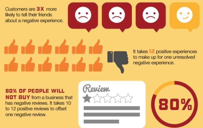
There’s a lot to take in with these eTouchPoint stats, starting with the fact that the average person is three times more likely to tell a friend about a bad experience with a business than they are a positive one. That may seem harsh, but it makes sense when you realize that most of your customers expect things to go well. If your UX design agency hasn’t done a good enough job of mapping out the user journey, the customer gets frustrated and wants to vent.
Customers venting also has a severe impact on your bottom line, as these stats show us that four out of five customers (80%) won’t buy from companies that have negative reviews. And it’s also really hard to make up for a bad experience, as you need to deliver a minimum of 12 great experiences to make up for one bad one. Negative feedback (and the drop in business that results) tarnishes your company’s reputation. With UX being such a critical part of creating a good experience, it’s best to get it right the first time with the help of people who have UX design skills.
Create a Smooth Journey From Discovery to Purchase
The journey your users take with your company is just like any road trip you’ve ever taken in a car.
You start by figuring out where you want to go (which means what you want to buy or learn about if you’re a customer.) With your destination in mind, you pull out a map (or do some research) to figure out the best way to get there. We’ll conveniently ignore the existence of GPS for the sake of this analogy. With your research complete, you jump in the car and start the journey.
And that’s when things have the potential to go wrong.
If the car is your company’s website or mobile app, then every mechanical malfunction is a bump in the road that makes the journey more difficult than it has to be. Your customer (i.e., the driver) expects the car to work how it’s supposed to work. If the brake light comes on (a link doesn’t work) or the engine conks out (the app crashes), the road trip will be one to remember for all of the wrong reasons.
It’s all about making it as easy as possible for your customers. Remember our stats about getting the interactive elements of a website right? Over two-thirds of people (78%) of them value ease in the journey above all else on a website, so you have to make sure your “car” is serviced and ready to take customers on a smooth ride.
That all falls under the UX designer responsibilities umbrella.
A Huge Return on Investment
“Fine, so delivering a good user experience is obviously important,” we hear you say. “But it costs my business money to research and hire UX design agencies. Is it really worth the cash I’m going to spend?”
We could pull your attention back to all of the stats we’ve shared about customers abandoning companies (and often badmouthing them on the way out) to show the value of UX design. But we think these stats from Wove On do a better job of demonstrating the value of getting the customer experience right:
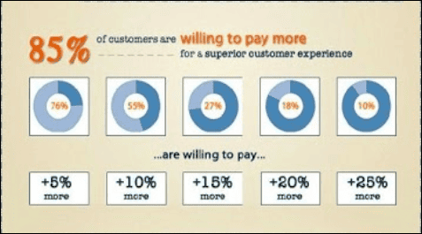
According to this chart, an enormous 85% of people are willing to spend more on a business (and its products) if it offers a top-notch user experience. How much more depends on the customer, though there’s an interesting breakdown of those numbers here. About three-quarters of customers (76%) say they’ll pay 5% more than your current asking price if they’re guaranteed to get a great experience. Over half (55) will shell out 10% more, with one in every 10 customers saying they’ll pay 25% above market value to get a good experience.
The message is clear – top UX design agencies don’t just help to keep customers coming through the doors. Their work also puts you in a position to ask for more from customers, which many are willing to pay because you give them an experience they appreciate.
The Elements of UX Design
Surface
This is where your UI works come in, as you’ll dress up your site or app so it looks the part. Think of this like picking out an outfit for a first date. You want to dress to impress, but it’s the substance that lies below that’s going to have the biggest impact on your potential other half.
Skeleton
You can put the Halloween decorations back in the closet because a UX skeleton is more of a wireframe design of what you’re going to create. It’s like putting together LEGO. You need to figure out which pieces slot where to make something amazing.
Structure
Once you know how your building blocks fit together, you’ve got to figure out how the user’s interactions work. A UX team’s interaction designers pull their hair out here, as they’ll come up with creative solutions to make your website or app’s information architecture flow like water.
Scope
This is where you put on your problem-solving hat and ask yourself what challenges you’re helping the user to solve. That answer can often be simple (such as helping them land on a product that helps them), but can be pretty complicated if you’re building a tool with a ton of different applications. The greater the scope of your work, the more time you have to put into developing the UX.
Strategy
While scope helps you confront some of the user problems you’ll solve, your strategy sets them in stone. From there, you can figure out how being the problems-solver through your UX aligns with your company’s goals.
What Customers Say About Us
Randall T.
Transparent web design pricing tailored to your business needs.
Book a free consultationOur UX Design Process
Understand the User and Brand
Trying to develop a UX when you know nothing about your brand or your target user is like trying to fly a plane with no training. You can poke around at a bunch of buttons and stuff will happen, but you’re not going to stick the landing because you have no idea what you’re doing.
Hopefully, you already know plenty about your brand in terms of what it delivers, what problems it solves, and its mission. Translating that to a UX is less about filling websites and apps with content (though that’s part of it) and more about understanding how your mission translates into the experience you deliver to a customer. For example, if part of your mission statement talks about how you “solve problems and look cool while doing it,” you need to deliver a UX that’s fun, edgy, and a blast to play around in if you don’t want to look decidedly uncool.
When it comes to your users, understanding stems from knowing what they want and why they want it. Hopefully, you have some idea of what your ideal customer looks like, but if you don’t, the next stage of the process helps you to figure it out.
User Research
Knowing who you’re selling to (and, thus, who’s going to engage with your UX) seems like it should be the simplest thing in the world. And yet, research from HubSpot shows us that only 42% of marketers know the basic demographic information for their audience, meaning 58% of them are trying to shoot for targets that don’t exist.
The following chart highlights the scale of the problem:
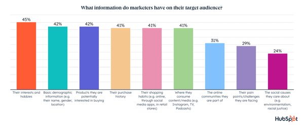
In all cases, over half of marketers can’t provide the answers to the questions they have about their users. Over half (55%) know nothing about their target audiences’ interests or hobbies, while 58% couldn’t tell you anything about the products they may want to buy. A staggering 71% have no idea what problems their customers want to solve, which is mind-boggling seeing as every company is ultimately in the business of providing solutions.
If you count yourself among the people who don’t know enough about your customers, this stage of the UX design process is all about getting educated. NEWMEDIA uses a combination of techniques to learn about your users, including:
- User interviews
- Online surveys
- User testing
- Existing customer data
Collectively, the information gathered from these activities allows us to create user personas for your business, with each of those personas being representative of your ideal customers. The more we know about those customers, the better the UX we can create to serve those customers.
Analysis
By this point, developing your UX starts to feel exciting. You know who you’re building the thing for, and you understand how you’re going to use your UX as a conduit for the message you want to send. But you don’t want to jump the gun here. Having all of the ingredients for a recipe doesn’t mean anything if you don’t know how to portion those ingredients out to create a tasty dish. You’ll just end up tossing everything into the pan, ending up with a mish-mashed concoction that tastes awful.
That’s our way of saying that analysis follows research – i.e., figuring out what the collected data tells us.
For example, let’s say your user research turns up the fact that your ideal customer isn’t one for showy graphics and explosions of color. That’s a valuable piece of information because it informs both your user interface design and how you’ll talk to your user as you deliver your experience. If you don’t take the time for analysis after research, you may miss this golden nugget of information and end up delivering something that your user will take one whiff of before turning their noses up.
Create User Flows
This step is all about your UX designer figuring out the information architecture that sits behind the experience you’re creating. Think of this like planning out the chapters in a book. Each chapter has to flow on from the ones that came before, carrying over the various plot elements and character tropes established before. The second you start mixing and matching a book’s chapters, you get an out-of-order experience that leaves you feeling confused.
The same happens if the experience you create doesn’t have a logical flow from A to B to C. Going from A to H to X to D leaves users feeling upset, which makes them reach the decision that you’re not for them.
Wireframes are the key to a user flow. For example, if you’re designing a website that has 20 web pages, your wireframes do two things:
- Demonstrate how each textural and visual element on the page flows together (which is user interface work, by the way)
- Show how each individual page links to the others, with some pages having direct links while others have indirect ones
The goal here is to avoid dead ends, abrupt stops, and anything else that makes a user stop and scratch their head.
Visual Design
To continue our book metaphor, if the user flow is all about plotting out how each chapter flows from the one that came before, the visual design is all about the content in your chapters. In other words, it’s here where you make your user experience as pretty as it can be while ensuring that your graphic design elements flow together rather than creating the sort of cluttered mess we saw when looking at www.cruise.co.uk’s old home page.
This process starts with prototyping, which transfers your wireframes into your app or website so you can see for yourself how they flow together. From there, our UX design team starts adding the visual and textual elements that give your pages some sizzle to go along with the steak (i.e., the usability) that the wireframes created.
Prototyping often turns into an iterative process where we keep tweaking and changing until we find the right combination of elements to create a fun (and valuable) experience. Eventually, the prototypes evolve into something usable, putting you in a position to launch your UX.
As an aside, the prototyping process tends to incorporate multiple rounds of user testing that exist to see if (and how) the average person can “break” the UX. Those tests often reveal that you need to make fixes for problems you didn’t even know existed, in addition to potentially showing you how some users will want to use the UX for things you didn’t intend (which can give you some ideas for future tweaks).
Launch the Digital Product
It’s t-minus 10 days to launch and you want to do everything you can to send your UX hurtling like a rocket into the public consciousness. The alternative is a launch with no fanfare, resulting in your new website or app taking off with a squeak rather than an almighty bang.
Building up a buzz through advertising and marketing can help your launch, as can offering a pre-launch that allows early adopters to get a taste of your new experience. Pre-launches (assuming they go well) can also turn your early adopters into evangelists for your product, meaning they’ll tell other people that your UX is awesome.
There’s also some touching up to do before you press the big button that sends your UX rocket flying into the sky. For example, if you’re launching across both desktop and mobile devices, you need to test extensively to ensure everything looks and feels as it should across all. Having one part of the rocket working perfectly won’t mean a thing if the fins fall off somewhere else.
Track and Tweak
As nice as it would be to set and forget your new UX, the reality is that you’re going to constantly analyze and tweak what you have to make it even better. Some of that analysis centers on making sure your UX stays up to date. Take a look at some mobile websites from the early days of smartphones and compare them to the feature-rich mobile experiences of today to see how changing technologies can drastically affect what you deliver to your customers.
Other changes come in the form of little tweaks that make the experience better. Split testing (also called A/B testing) lets you play around with colors, layouts, and other design elements to see what gets the best responses out of your users. Speaking of users, they can also help with future-proofing your experience, as every suggestion or complaint you receive points you in the direction of something you can add to make your product better.
As with every stage of developing a UX, NEWMEDIA acts as your eyes and ears so you can keep testing and tweaking to streamline what you’ve created.
Work with NEWMEDIA's
UI and UX Designers
Though many position UI and UX design as though they oppose one another, the truth is that UI feeds into UX. The interfaces you create serve as the front end of your product, with users getting a good experience based on how that front end reacts when they start to play with it.
NEWMEDIA is the UI and UX design agency that helps you to develop your products and get them ready for launch. Here’s why you should work with us:
- The industry recognizes our talents, with UpCity naming us as one of the top 1% digital design agencies in 2022. We’re also three-time National Excellence Award winners, receiving gongs in 2019, 2020, and 2021.
- NEWMEDIA counts some of the biggest brands in the country as beneficiaries of our UI and UX design services, including CBS Television, the YMCA, and PostNet.
- We take a different approach to design, seeing it as far more than a checklist of “features” we need to add to an experience. Every UX we create is specifically crafted to wow your users and meet your business goals.
Turn your website into a revenue driver with our expert design and marketing services.
Get my custom website quote