In the previous post we setup a mixin that lets us create component layout styles where we can define how many components per row we want and how wide we would like the margin between those components to be. Now we’ll improve the mixin to work with different screen sizes with media queries!
Part two of a two-part article: Working Through a Mixin: Part 1
Media Queries
First, let’s just try using the mixin the way it is currently setup in a mobile first, media query scenario. We’ll call the mixin outside of all media queries since that will be our default (mobile first) layout, then we’ll call it inside the two media queries. Let’s also move the float out of the mixin and put directly on the selector. Since the components will always need to float there is no need for that property to be generated in the compiled CSS more than once.
.inner-component {
  @include calc-container(2, 1);
  float: left;
  height: 150px;
  background-color: #565656;
  @media all and (min-width: 480px) {
    @include calc-container(3, 1);
    height: 180px;
  }
  @media all and (min-width: 768px) {
    @include calc-container(4, 0.5);
    height: 200px;
  }
}
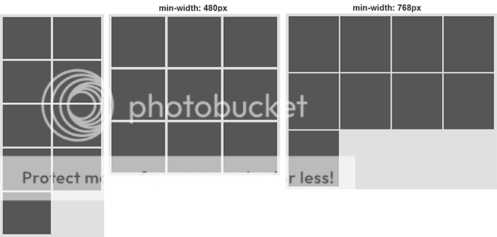
If we look at the on-screen results, something is not right.

Now if we look at the CSS that is compiled from the Sass we can see what is wrong.
.inner-component {
  width: 49%;
  margin: 2% 2% 0 0;
  float: left;
  height: 150px;
  background-color: #565656;
}
.inner-component:nth-child(2n) {
  margin-right: 0;
}
.inner-component:nth-child(-n+2) {
  margin-top: 0;
}
@media all and (min-width: 480px) {
  .inner-component {
    width: 32.33333%;
    margin: 1.5% 1.5% 0 0;
    height: 180px;
  }
  .inner-component:nth-child(3n) {
    margin-right: 0;
  }
  .inner-component:nth-child(-n+3) {
    margin-top: 0;
  }
}
@media all and (min-width: 768px) {
  .inner-component {
    width: 24.5%;
    margin: 0.66667% 0.66667% 0 0;
    height: 200px;
  }
  .inner-component:nth-child(4n) {
    margin-right: 0;
  }
  .inner-component:nth-child(-n+4) {
    margin-top: 0;
  }
}
The problem is the styles inside the media queries are inheriting the values on the :nth-child pseudo class selectors further up in the CSS and that is setting the top and right margins to zero on the wrong components. In this scenario the second component inside the min-width: 480px media query will have a top and right margin of zero, which will break the layout. One way we could fix this is too simply put each mixin in a media query that is set to both a min-width and max-width. However, that goes against what we are trying to do with our mobile first approach. Another idea is to override the margins that are set to zero with their proper value. We can achieve this by using a combination of the :not and :nth-child selectors, where we target everything that is not the last component and set their margins.
@mixin calc-container($components-per-row, $margin-thickness) {
  // First let's set some variables and do some math.
  $component-width: (100 / $components-per-row) - $margin-thickness * 1%;
  $remainder-width: 100 - ($component-width * $components-per-row);
  $total-margin: $components-per-row - 1;
  $margin-width: $remainder-width / $total-margin;
  // Now let's set some property values with those variables and math
  width: $component-width;
  margin: $margin-width $margin-width 0 0;
  &:nth-child(#{$components-per-row}n) {
    margin-right: 0;
  }
  &:nth-child(-n+#{$components-per-row}) {
    margin-top: 0;
  }
  &:not(:nth-child(#{$components-per-row}n)) {
    margin-right: $margin-width;
  }
  &:not(:nth-child(-n+#{$components-per-row})) {
    margin-top: $margin-width;
  }
}
That results in this CSS.
.inner-component {
  width: 49%;
  margin: 2% 2% 0 0;
  float: left;
  height: 150px;
  background-color: #565656;
}
.inner-component:nth-child(2n) {
  margin-right: 0;
}
.inner-component:nth-child(-n+2) {
  margin-top: 0;
}
.inner-component:not(:nth-child(2n)) {
  margin-right: 2%;
}
.inner-component:not(:nth-child(-n+2)) {
  margin-top: 2%;
}
@media all and (min-width: 480px) {
  .inner-component {
    width: 32.33333%;
    margin: 1.5% 1.5% 0 0;
    height: 180px;
  }
  .inner-component:nth-child(3n) {
    margin-right: 0;
  }
  .inner-component:nth-child(-n+3) {
    margin-top: 0;
  }
  .inner-component:not(:nth-child(3n)) {
    margin-right: 1.5%;
  }
  .inner-component:not(:nth-child(-n+3)) {
    margin-top: 1.5%;
  }
}
@media all and (min-width: 768px) {
  .inner-component {
    width: 24.5%;
    margin: 0.66667% 0.66667% 0 0;
    height: 200px;
  }
  .inner-component:nth-child(4n) {
    margin-right: 0;
  }
  .inner-component:nth-child(-n+4) {
    margin-top: 0;
  }
  .inner-component:not(:nth-child(4n)) {
    margin-right: 0.66667%;
  }
  .inner-component:not(:nth-child(-n+4)) {
    margin-top: 0.66667%;
  }
}
Finishing Touches
And now our layout behaves how want in all the scenarios.
However we can still improve our mixin so the CSS it generates is more efficient. If we look at the CSS that is currently being compiled, we can see that the :not selector is being applied to our first block of CSS that is outside of the media queries. Since it is not necessary to have these selectors and styles for this block of CSS, let’s get rid of it. Sass gives us the ability to use conditional statements to test if something in our code is true or false. Since we only want to run this part our code to run if it is inside of a media query, we need to setup some logic.
Let’s give our mixin a third parameter that allows us to determine if the mixin is being called inside a media query. We’ll create a new parameter called $media-query and set the value to false be default. (You could also set default values for $components-per-row and $margin-thickness parameters, but it’s not necessary.) We will then create an if statement based on the value passed to that parameter to determine if the :not selectors will be created when the CSS is compiled from the Sass. And finally we will pass ‘true’ as the third argument in our mixin whenever we call it within a media query. Notice we do not need to pass false to our first mixin call outside of the media quries, because it is set to false by default.
@mixin calc-container($components-per-row, $margin-thickness, $media-query: false) {
  // First let's set some variables and do some math.
  $component-width: (100 / $components-per-row) - $margin-thickness * 1%;
  $remainder-width: 100 - ($component-width * $components-per-row);
  $total-margin: $components-per-row - 1;
  $margin-width: $remainder-width / $total-margin;
  // Now let's set some property values with those variables and math
  width: $component-width;
  margin: $margin-width $margin-width 0 0;
  &:nth-child(#{$components-per-row}n) {
    margin-right: 0;
  }
  &:nth-child(-n+#{$components-per-row}) {
    margin-top: 0;
  }
  @if $media-query == true {
    &:not(:nth-child(#{$components-per-row}n)) {
      margin-right: $margin-width;
    }
    &:not(:nth-child(-n+#{$components-per-row})) {
      margin-top: $margin-width;
    }
  }
}

.inner-component {
  @include calc-container(2, 1);
  float: left;
  height: 150px;
  background-color: #565656;
  @media all and (min-width: 480px) {
    @include calc-container(3, 1, true);
    height: 180px;
  }
  @media all and (min-width: 768px) {
    @include calc-container(4, 0.5, true);
    height: 200px;
  }
}
We can now use our mixin wherever this pattern is needed, and we are happy—hopefully.